Comic for Wednesday, July 15th
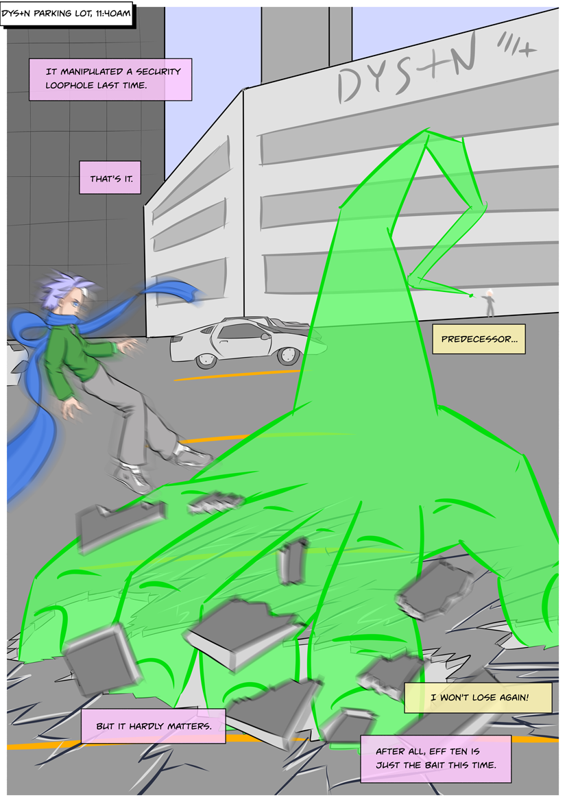
I truth I feel bad about switching scenes there. Interestingly enough originally I’d intended to follow Mium from when he left the classroom to here rather than show Peter and Tyler arriving and… ah… negotiating. Anyway… we’ll see more of them and Kally soon enough, I promise! I suspect at this rate Kally will get her own since she’s fallen so far behind on plot threads.
I also feel bad that this page is one panel. For a bit I contemplated putting up two pages today, but unfortunately my schedule this week is quite unfriendly to comic-drawing, so I better leave the buffer intact… maybe if I have some extra time this weekend we’ll get a bonus page 🙂
Why is Mium here? Why is Ila here? Why can’t everyone just get along? Whose words are in pink bubbles? Can I make the dialogue overlays anymore confusing if I try?! Is Dys+n really spelled with a plus sign? How the how do you even pronounce that? Some of these questions will be answered! Maybe.
As for the vote incentive… it was part of a doodle I did for someone discussing artistic license special effects – ie; it’s unlikely the Naomi’s hair and Mium’s scarf actually get longer during action scenes, but I tend to draw them longer anyway. Mium’s scarf is pretty ridiculous next page that way – I bet I could canon the hair thing, but the scarf would be harder to explain… Good thing the scarf will – uhhh – nevermind. Spoilers.


The rectangular dialog boxes seem to be some kind of edios radio as well as thought bubbles. If the purple boxes here are Mium’s then the first word should be I instead of It and the shade should match the purple on page http://pastutopia.com/?comic=comic-for-wednesday-may-6th.
If the purple box is eff-10’s control (possibly Gate) then possibly you should pick another color on this and the next page to be clear. Also if eff-10 is intentionally transmitting on this page then her dialog should have the > in front of it. Unless the dropped > represents a closed security hole in which case panel 4 of the above referenced page should also get >.
It’s confusing, I think, but the purple boxes are Mir’s commentary, and the Yellow are Eff-10’s. Neither are really being transmitted, Mir’s are being said outloud at a different location.
In general, thought bubbles are loosely linked to hair or hair color, but, that’s hardly a perfect solution.
I would probably do this differently now, I don’t know what PastUtopia was doing back then.
As to what Past Utopia was probably doing back then the > indicated sub-vocal communication from across a parking lot and to the top of a 2 story parking garage or effectively transmitting see this page. http://pastutopia.com/?comic=comic-for-monday-april-27th-2.
So Mir is controlling eff-10 the hair color thought box connection is a detail that eluded me, makes sense now.
When I saw the mouse-over text I thought I’d been missing mouse-over texts all along… but I couldn’t find another one!
Why do you do these things!! >.<
Haha – this is indeed the only comic page to a have alt text for the mouse over that isn’t just the date.
I won’t do them regularly, but I can’t promise there won’t be more… 😀
Sigh…mouse over text not mobile visible.
Haha – sorry. I almost never use mouse over text and when I do it’s just dumb little comments. The one this page was “Someone picked a really bad day to bring their new car to work” 🙂
I’ll try to leave the mouse over in commentary in the future for mobile readers; I know my site is tough enough for you guys 😀
Bait a hook for a minnow, and you may catch a shark.
Let’s run them down: Why would you want to apologize for a brilliant suspense-building maneuver. Besides, we’ve been wondering what Mium and Ila have been up to.
If one panel can show everything necessary, why would you need more? One panel can also show the action in context rather than piecemeal.
Unless something vital happened between Mium leaving the classroom, and Ila’s attack, the way you handled it has a much tighter flow, and is more exciting, to boot.
I’m guessing “Dyson”. ^^
Anything long and flowing seems even longer during action.
Besides, If it looks cool, who cares? 🙂
And, dem cars! Your vehicles are several orders of magnitude better than formerly. I’m impressed. ^^
Haha – I appreciate the kind outlook and positive comprehensive feedback 😀
I dunno, I figured that I cut away from Kally and the school in general too much. We still haven’t really seen wtf they actually do at the school for the most part.
I figure that people are suspicious of artists passing off one panel pages as updates 😀 I actually like the bigger shots occasionally, but will try not to abuse them 😀
Yes, I pretty much agree that looking good or entertaining trumps being realistic in art, and doubly so for action scenes. Still the literally interpretation of artistic license sometimes amuses me 😉
I went through a series of ideas “Dice Plus N” sounds unrealistic, no one spends four syllables on a companies name; I considered they’d just call pronounce it as a t – but that’s a little awkward “Dice-ta-n” but seems plausible. Just ignoring the antics of the plus sign and going with “Dyson” seems pretty plausible too. I’ve been trying to avoid company names that simply shortened to acronyms because we already have so many of those from the various government branches (MSB, IDS, etc).
I appreciate that you humored even the most ridiculous questions of the commentary 😀 Your comments never cease to amaze.