Comic for Monday, March 30th
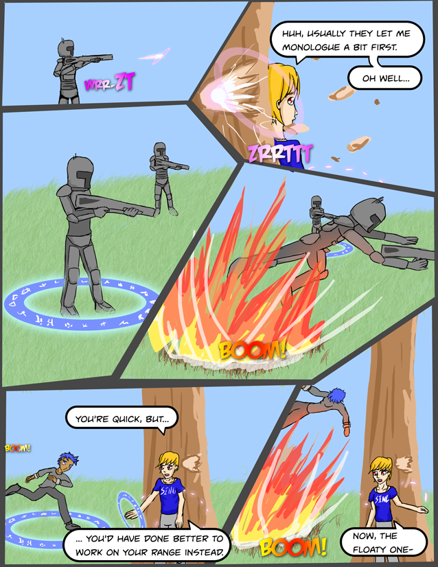
Not too much to add… I’m not super thrilled with an of the art on this page, but nothing boggles the mind in how horrible it was. I think I sort of stagnated on picture distance/angle again; particularly when I’m doing action sequences I think I need to look to other comics to see how they handle; I’m guessing there are plenty of examples of more dynamic flowing action.
In truth, largely due to how uncomfortable I am trying to draw actions scenes in particular, I’d originally planned for this arc to be offscreen and stay with Peter at Levinworth. I decided to draw this arc after all (for a handful of reasons, though I have some regrets currently 🙂 ). Don’t think it’d be fair to cut away yet now 🙂 Plus practice, yadda yadda, though I’m a little concerned with how little time we’ve spent with what is actually going on and why we care (particularly the why we care part) – but I think it won’t be so bad in the long run; I’d rather develop the story right instead of vomit expositions in walls of text, but if we don’t explain why people should care or who some of these people are sooner or later, we are going to get a little mired in the great Swamp of WTF.
We’ll see, I guess!


Unless you’re going to go all J.R.R. Tolkien and create your own languages, you don’t need all that many different glyph shapes. It is, however, pretty important to come up with something that doesn’t look like real letters, so some jackass can’t claim you used his name in your comic.
And watch out for extremely fine detail. Anything smaller than a pixel on my smallish laptop screen is going to show up AS a pixel no matter how much time you spent drawing it. \
On the other hand, you’re doing better than you think you are, so just keep going. 🙂
Haha, they’re mostly meaningless, even to me – they are combination of alchemy symbols, random shapes, radicals, and the occasional number.
I just think I should try to make them look sharper/cleaner and less like scribbles for thematic reasons that’ll be explained later (not in the spoiler sense, just not too much about how the magic works / is being used has been outlined yet). I don’t expect anyone to try to read them, and they wouldn’t have much luck if they tried 🙂
“Practice” is a good reason to do the page. Here’s a list of what I think “worked”:
The explosion effect looks good, and has a nice balance to it.
The magic effect circles that cause/contain the blasts look logical based on the laws of your universe.
I like the fact that the guy in the background was so distracted by the first blast that he didn’t notice the circle around his own feet.
The layout is creative, and leads the eye around the page well.
I like Mr. Red-Eyed-Mystery-Man’s attitude, and his hand gesture effect gave a real 3D effect.
And the grass looks more, um, grassy. 🙂
I really appreciate the feedback; it’s always hard to see your own work objectively, and a set of objective eyes giving feedback is always helpful.
I think the magic circles are getting better; I also hope that what they represent becomes a little more clear in time – I was torn on including them originally, but I think they serve an important visual element – in time I want to come up with a way to do the symbols on them much more “cleanly”, maybe I can figure out making my own font for them someday.