Comic for Wednesday, March 11th
Mar11
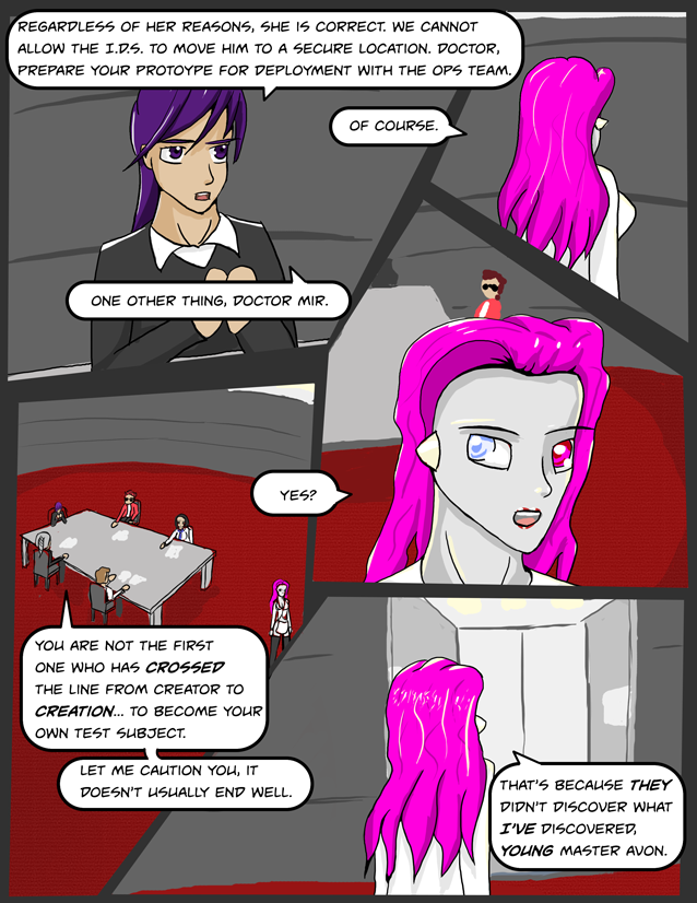
Perspectives and backgrounds… tricky things those.
Not too much to say on this one, I tried to do more angle than usual – I tend to have a habit of trying to draw my comics as if the world was 2d – trying to actually put the characters into the background is tricky. Not entirely sure I succeeded here, and the art isn’t quite up to the level I would like as a result.
Hopefully friday will be better!


Frame one is missing an “a” between “to” and “secure”.
Fixed! Thanks 😉
Umm. unfixed. Should read “to a secure location” not “to secure a location”
BetterFixed. Fortunately I still had the warranty on the last fix… 😉
Thanks!
Oooh, BURN! On the other hand, hubris doesn’t usually end well, either. 🙂
Your perspectives look pretty good, (the far end of the table in panel 4 looks a little high) but your proportions are right. Given that NO artist ever perfectly captures what they see in their mind’s eye, I’d say you were doing better than you think. 🙂
Yes – I think the table is a little too top down compared people. I appreciate the kind words; its a learning process, and I hope to make some good strides with the art in coming chapter.
As for their claims… I promise we’ll see both their points down the road eventually. Mir has many things going for her, but indeed, humility is not one of them.